Hotel Booking: Tableau Edition (Part 1 of 3)
Today, I’m transitioning from Python coding to data visualization, and I’ve selected the “Hotel booking” dataset from Kaggle for analysis. After exploring the data, I plan to create a dashboard using Tableau software. This dataset comprises 119,390 observations for both a City Hotel and a Resort Hotel, covering hotel bookings from July 1st, 2015, to August 31st, 2017. It includes bookings that were successfully accommodated and those that were canceled.
With 36 columns and 119,390 rows, the “Hotel booking” dataset offers a wealth of information. Here are some key columns for analysis:
[‘hotel’, ‘is_canceled’, ‘lead_time’, ‘arrival_date_year’, ‘arrival_date_month’, ‘arrival_date_week_number’, ‘arrival_date_day_of_month’, ‘stays_in_weekend_nights’, ‘stays_in_week_nights’, ‘adults’, ‘children’, ‘babies’, ‘meal’, ‘country’, ‘market_segment’, ‘distribution_channel’, ‘is_repeated_guest’, ‘previous_cancellations’, ‘previous_bookings_not_canceled’, ‘reserved_room_type’, ‘assigned_room_type’, ‘booking_changes’, ‘deposit_type’, ‘agent’, ‘company’, ‘days_in_waiting_list’, ‘customer_type’, ‘adr’, ‘required_car_parking_spaces’, ‘total_of_special_requests’, ‘reservation_status’, ‘reservation_status_date’, ‘name’, ‘email’, ‘phone-number’, ‘credit_card’].
As I delved into the data, several questions arose, such as:
- What is the average lead time during the winter and summer seasons?
- Which states have higher numbers of families with children staying on weekend nights during the summer? And during the winter?
- During which month do we observe the highest number of guests on the waiting list?
- Is there any correlation between lead time and cancellation status?
- How do booking dynamics differ between resort hotels and city hotels?
- Which countries prefer booking invitations for resort hotels over city hotels, and vice versa?
- Where do we observe more fluctuations in booking invitations?
- How many room upgrades have occurred in each season based on “reserved room type” and “assigned room type”?
Focusing on my goal, I’ve distilled these questions into a concise set to present on the Tableau dashboard I’m creating.
Let’s start by giving you a quick preview showing you all my Tableau dashboard output:
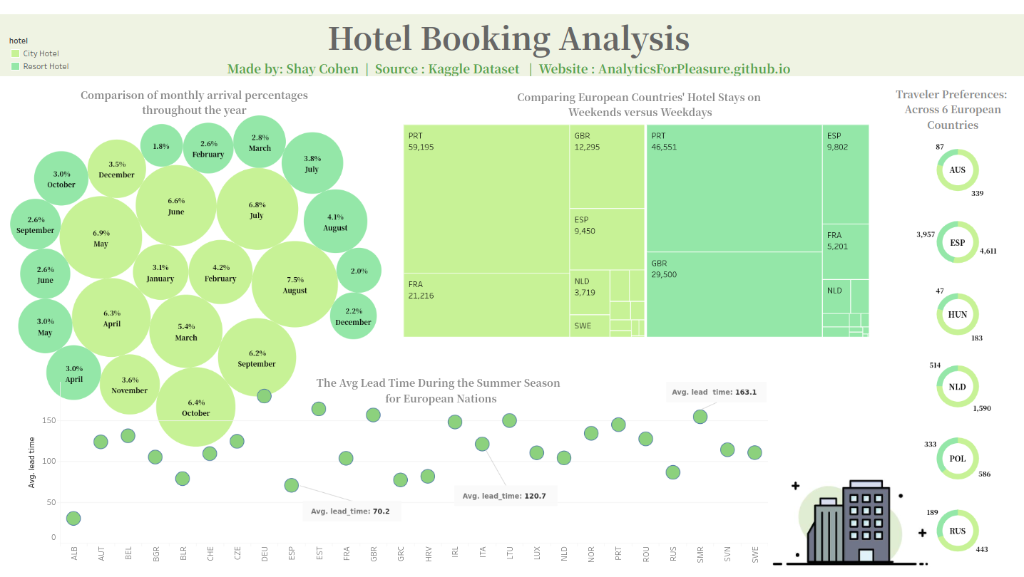
In the dashboard I’ve created, I’ve emphasized four charts, with three of them specifically highlighting the disparities between the City Hotel and a Resort Hotel. Upon reviewing the three charts below:
The green-yellow color in each series chart represents the City Hotel series, while the green series chart represents the Resort City.
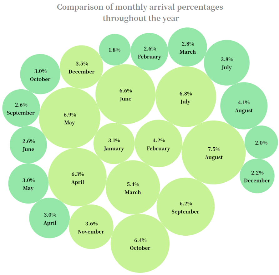
Let’s delve into the first chart I’ve developed - “Comparison of monthly arrival percentage throughout the year”. This bubble chart showcases two series of monthly data (spanning from January to December) for both Resort City and City Hotel. Each monthly bubble illustrates the percentage of guest arrivals for each hotel type. Notably, throughout all months and seasons, the Resort City consistently maintains a higher percentage. The most significant difference is observed during the summer season. For example, in July and August, resort hotels attract significantly more visitors, with percentages of 6.8% and 7.5%, respectively. In contrast, City Hotel percentages are considerably lower during these months, at 3.8% in July and 4.1% in August, representing a 45% difference between the two during the peak seasons.
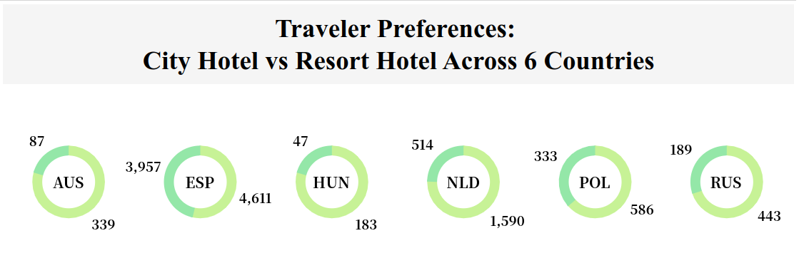
For my next chart, I’ve chosen to concentrate on six countries, with five of them being European: Russia, Poland, Netherlands, Hungary, Spain, and Australia. Displayed below, we can observe the level of attraction for each country, categorized by both Resort City and City Hotel. This visualization offers a fresh perspective on the insights obtained from the initial chart, showcasing a comparative analysis between the two types of hotels. I’d like to highlight the remarkable number of travelers attracted to Spain, totaling 3,957 + 4,611 = 8,568 visitors. This figure significantly surpasses the visitor counts of the other countries, underscoring Spain’s substantial appeal as a tourist destination.
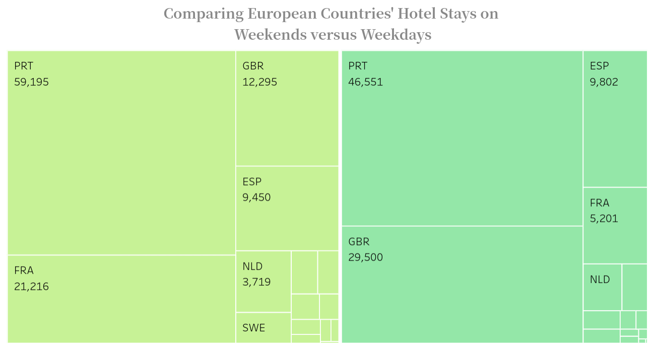
The third and final comparison between the Resort City and City Hotel can be observed in the tree chart provided below. In this chart, I’ve selected several European countries, including Portugal, Spain, England, France, Netherlands, and more, to analyze the number of visitors between weekends and weekdays.
As mentioned earlier, the dashboard is presented using Tableau software, which offers an interactive feature known as mouseover. You can navigate to my YouTube page - here to access a video demonstration where I provide detailed mouseover information about this chart. This feature allows you to gain insights into the number of visitors between weekends and weekdays for each square within the chart.
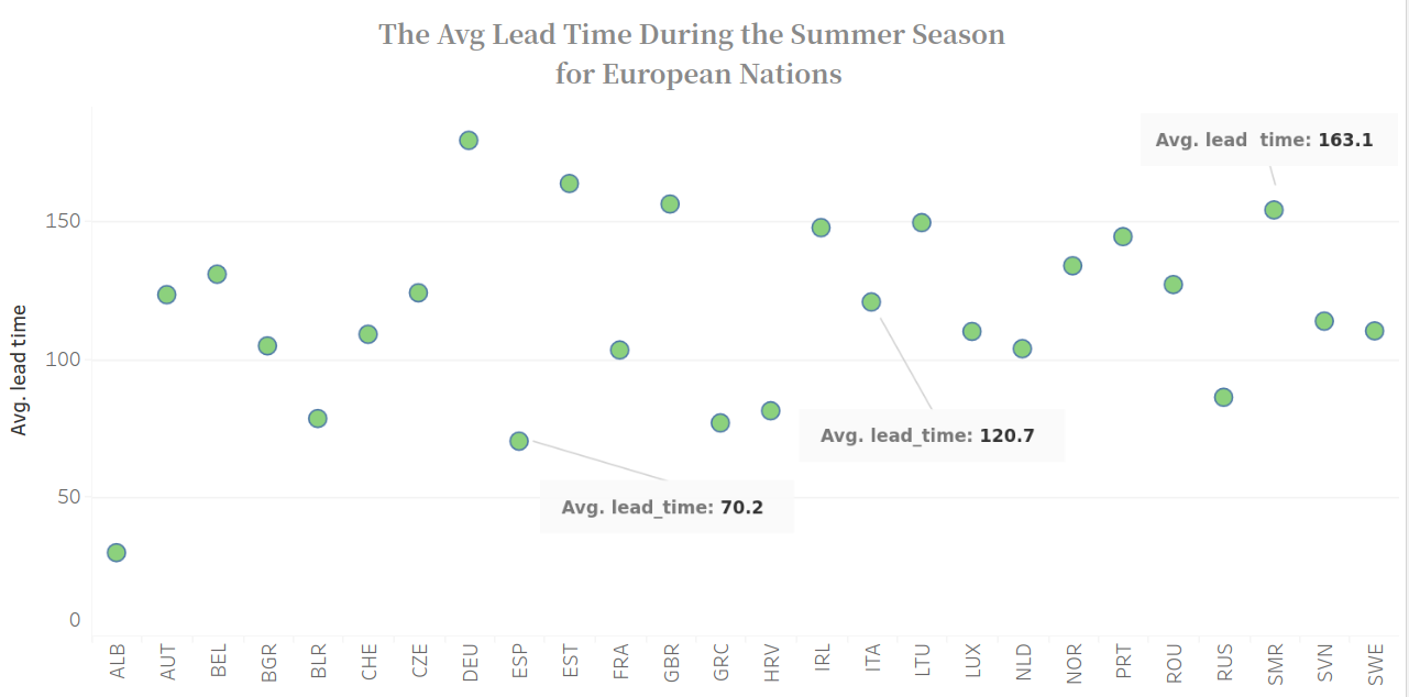
In the final chart of the dashboard, I aim to illustrate the average lead time during the summer season, spanning from June to September, across 26 countries. One notable observation is that Albania boasts one of the shortest average lead times, standing at just 39 days. Following closely is Spain, with an average lead time of 70 days. This comparison sheds light on the varying lead time durations across different countries, providing valuable insights into booking patterns during the summer season.