IMDB Analysis: Tableau Edition (Part 3 of 3)
Today, I’ll be concluding the final post in a series of three, demonstrating the superiority of advanced data visualization tools like Tableau software compared to others available in the market.
As we can see from my first 2 posts ( click here - School Shooting Analysis, Hotel Booking ) ,Tableau is a powerful data visualization tool that allows users to create interactive and visually appealing charts, graphs, and dashboards from various data sources. Tableau’s robust features enable users to analyze and explore data dynamically, facilitating data-driven decision-making processes across organizations. Additionally, Tableau offers integration with a wide range of data sources, including spreadsheets, databases, and cloud services, enhancing its versatility and usability in diverse analytical contexts.
In order to create a dashboard I firstly downloaded the dataset taken from the kaggle website.
This dataset contains 1000 rows and 16 columns.
Here are the column names: Poster_Link,Series_Title , Series_Title , Released_Year , Certificate, Runtime , Genre , IMDB_Rating, Overview, Meta_score, Director, Star1- star4, No_of_Votes , Gross.
While the dataset offers opportunities to explore numerous inquiries, our dashboard will focus on addressing just four specific questions.
Let’s take a brief look at the output of the dashboard I’ve created:
So, let’s dive right in!
I’d like to begin by showcasing the first chart, which delves into the ‘Genre’ column. This chart aims to uncover which genre categories have over 1000 movies - essentially, it seeks to understand audience preferences. Do viewers favor Comedy over Drama, or perhaps Biography over Mystery? Let’s delve into the findings to answer these questions. The analysis presented here will provide valuable insights into the movie genre landscape and shed light on audience preferences.
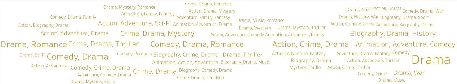
From the chart above, it’s evident that the most frequently occurring genres in this dataset are Drama, Romance, and Action.
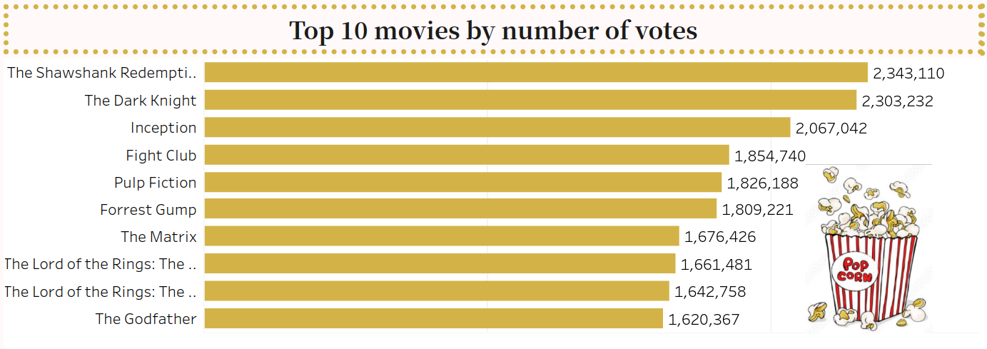
As we’re aware, the number of movie releases has been significant over the years. Hence, I intend to shift the focus to my second chart, which will highlight the ‘Top 10 movies by number of votes.’ This analysis will be visually presented through a horizontal bar chart, offering insights into the most popular movies based on audience votes. By identifying these top-voted movies, we can gain a deeper understanding of audience preferences and cinematic trends.
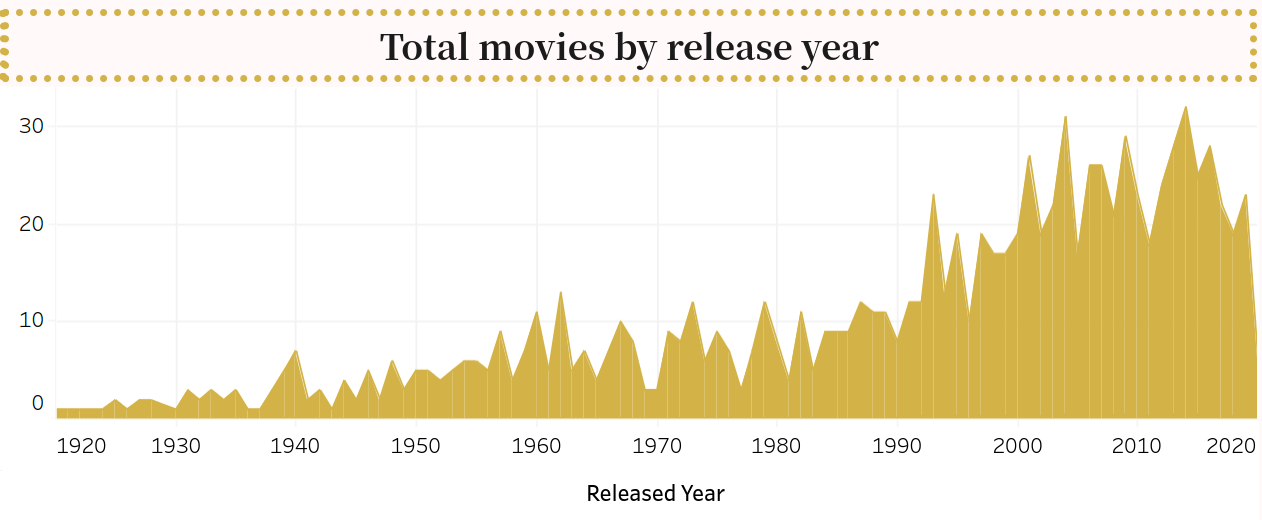
In my third analysis, I’ll be presenting a line chart illustrating the total number of movies released each year from 1920 to 2022. Upon closer examination of the data, we observe a gradual uptick in annual movie production over the years. By the 1990s, there’s a distinct spike in film releases, averaging between 20 to 30 per year. However, the year 2020 saw a notable downturn in movie output, likely influenced by the COVID-19 pandemic and its ensuing impact.
In my fourth chart, I aim to introduce a more statistical dimension. Therefore, I will analyze the entire set of certified movies, categorizing them by genre. For each genre, I intend to calculate the number of movies falling within specific quartiles of the IMDb rating distribution: the upper whisker, upper hinge, median (50th percentile), lower hinge (25th percentile), and lower whisker. For instance, let’s consider the genre category ‘Comedy, Drama,’ which comprises 80 movies. I will examine how many movies fall within various IMDb rating ranges, such as from the lower whisker (Q1, 7.5-7.75 IMDb rating) – let’s say 10 movies, to the lower hinge (25th percentile, 7.75-8.00 IMDb rating) – let’s say 29 movies. Furthermore, I’ll explore the number of movies at the median rating (50th percentile) and those that fall above the median but below the upper hinge (50th-75th percentile, e.g., 8 to 8.5 IMDb rating) – let’s say 40 movies. This comprehensive analysis will provide deeper insights into the distribution and quality of certified movies across different genres.
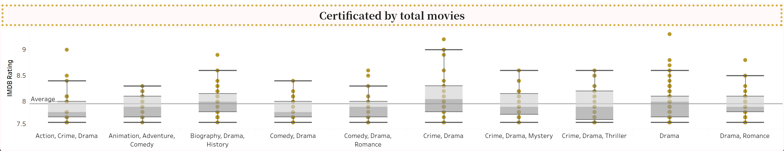
As highlighted in my initial Tableau post, the dashboard is showcased through Tableau software, featuring an interactive functionality called mouseover. For a comprehensive demonstration, you can visit my YouTube page linked here, where I delve into detailed mouseover explanations regarding this chart. With this feature, you can explore insights within the boxplot numbers and seamlessly navigate between different genres for deeper analysis.