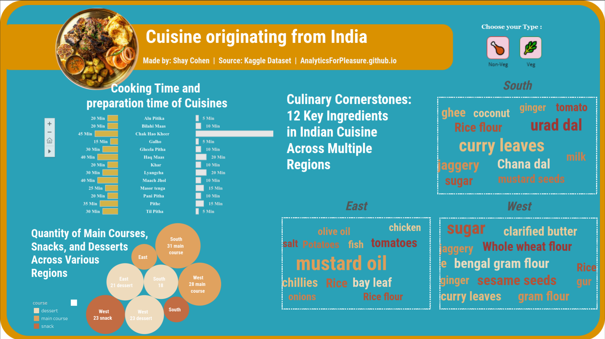
Exploring the World of Indian Cuisine Through Analysis with Tableau
Today, I aim to blend two potent tools: Python (my usual go-to) and Tableau (as evidenced by my recent posts). Each excels in its own realm—Python for analysis in the domains of data science and data analytics, and Tableau for visualization, catering to graphic artists/designers and data analysts alike. By leveraging both, we’ll explore how to extract maximum value from data analysis and craft unique dashboards. Let’s dive into the data aspect!
For today’s endeavor, I’ve chosen to delve into a dataset sourced from Kaggle titled “Indian Food”. Comprising 9 columns and 255 rows, it promises an interesting exploration.
Here are the columns names:

Through this analysis, we’ll uncover insights into the rich tapestry of Indian cuisine, unraveling its flavors and ingredients. So, let’s embark on this journey of data discovery and visualization prowess, and unravel the story behind each culinary delight.
As usual, I will start with a sneak peek of the output dashboard about “Indian Food” - Click here to my Youtube Channel :
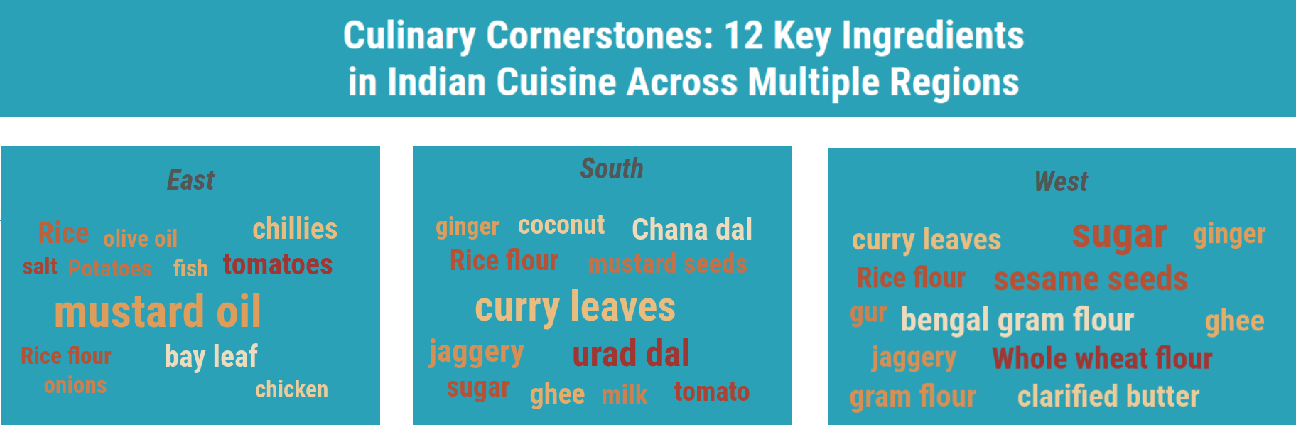
For my first analysis, I aim to examine the “ingredients” column. This column contains lists of ingredients for each dish. For instance, the dish “Nankhatai” includes six ingredients: Refined flour, besan, ghee, powdered sugar, yogurt, and green cardamom.
My curiosity led me to explore the prominent ingredients used in dishes from different regions. To delve deeper into this inquiry, I employed various scripts. These scripts allowed me to analyze the dataset comprehensively and extract insights about ingredient preferences across different regions. Below are two functions I developed to address this specific question, enabling a more nuanced understanding of regional culinary trends.
Here is part number 2 in order to get the output data for presenting it using tableau:
Here’s the final output result:
For my next initial analysis, I aim to focus on three key columns: Name, Prep_time, and Cook_time, which will be utilized to generate an output chart. Given the fundamental role of preparation and cooking times in crafting delicious dishes, the chart will display the duration of both stages for each dish. This analysis may reveal two distinct patterns: dishes characterized by lengthy preparation time but short cooking time, and conversely, dishes featuring brief preparation time but extended cooking time.
Let’s now consider a subset of 13 dishes from the total of 255 dishes :

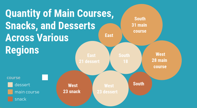
For the third and final chart in this dashboard, I opted to tally the number of main courses, snacks, and desserts across several regions (East, South, and West). From the chart, it’s evident that the West region has the highest number of snack dishes, totaling 23. Additionally, the South region boasts the highest count of main courses, totaling 31 dishes.