Analyzing Data with Python: A/B Testing
Introduction - What is A/B testing?
A/B testing, also known as split testing, is a method used to compare two versions of something to determine which one performs better. It’s commonly used in various fields, including marketing, product development, and user experience optimization. In A/B testing, two versions (A and B) of a product, feature, or experience are shown to different groups of users, and their responses or behaviors are compared to identify which version is more effective in achieving the desired outcome.

How to use control group in A/B testing?
The control group in A/B testing serves as the baseline against which changes introduced in the experimental group are compared. By maintaining existing conditions for this group, researchers can accurately measure the impact of variations implemented in the experimental group. Through random assignment and statistical analysis, the control group helps ensure unbiased comparisons and valid interpretations of the experiment’s results, guiding decision-making processes effectively.
In a scenario where you’re developing games for kids, conducting an A/B test could involve comparing the performance or engagement of different versions or features of the game. For example, you might want to test two versions of a puzzle game targeted at preschoolers, where one version introduces a new set of characters or challenges compared to the other. By randomly assigning children to either Version A or Version B of the game, you can measure metrics such as completion time, number of levels completed, or player satisfaction to determine which version yields better results. Through rigorous data analysis and statistical testing, A/B testing provides valuable insights into which game version resonates more effectively with the target audience, enabling game developers to make informed decisions about future iterations or updates. This iterative approach to game development helps optimize user experience and increase engagement, ultimately leading to a more successful product in the competitive market of kids’ games.
Today, we’ll delve into the data analysis of ‘Cookie Cats’, a highly popular mobile puzzle game developed by Tactile Entertainment. This game follows the classic “connect three” puzzle format, where players connect tiles of the same color to clear the board and advance levels. As players progress, they may encounter gates that require either waiting a significant amount of time or making in-app purchases to proceed further. These gates not only serve to encourage in-app purchases but also offer players necessary breaks from gameplay, potentially enhancing their overall enjoyment and engagement with the game. However, determining the optimal placement for these gates is crucial. Let’s begin by loading the data and examining the details.
Let’s begin delving into the data:
To kick off our data analysis, let’s examine the first column, “Userid”. Our initial inquiry is whether each “Userid” is unique.
Therefore, we will running the code bellow in order to find if there are not non - unique values:
1
df["userid"].nunique()
We find that there are 90,189 unique user IDs in our dataset ( The entire dataset)
Moving on to the next column, “sum_gamerounds”. we aim to understand the gaming activity of each user. Specifically, we want to determine:
- The number of users who never played the game.
And
- Identify any outliers that may skew our analysis.
Therefore, our first step is to determine the number of users who never played. We can accomplish this by executing the following code:
1
Players_who_did_not_played = df[df["sum_gamerounds"]== 0]["userid"].count()
We identify the count of players who did not engage in any game round.
Now, let’s proceed to identify and address any outliers within the dataset. We analyze the distribution of game rounds played by users using
1
Number_of_game_rounds_played_by_each_player = df['sum_gamerounds'].value_counts().sort_values(ascending=False)
While most users have played up to around 3,000 game rounds, we identify a rare observation where one user played an astonishing 49,854 rounds. To maintain data integrity, we opt to remove this outlier from the dataset to ensure accurate analysis and experimentation.
Now, let’s move on to the to the “version” column. This column present to us the 2 verions we want to check and make the A/B testing. Therefore, we would like to start with a short of info - A/B Groups & Target Summary Stats
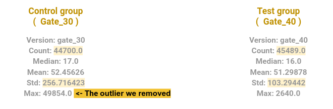
Now, let’s shift our focus to the ‘version’ column. This column represents the two versions we aim to compare in our A/B testing. To kick off, let’s provide a brief overview of the A/B groups and summarize their target statistics.
Here’s the output we got:
Reviewing the Summary Stats for the A/B groups:
- The group with the gate at level 30 comprises 44,700 records, while the group with the gate at level 40 consists of 45,489 records.
- Notably, the group with the gate at level 30 exhibits a clear outlier, with one user having played 49,854 rounds within 14 days of installing the game, while the next highest record is below 3,000 rounds.
- Interestingly, the standard deviation of the Control group is higher than that of the Test group, with values of 256.7 and 103.3, respectively.
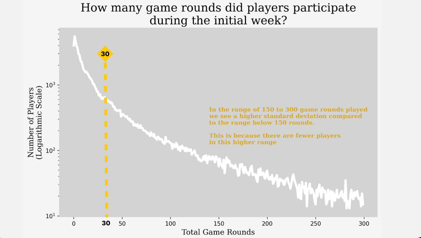
The ‘sum_gamerounds’ column holds crucial significance. Let’s analyze the data in this column using a matplotlib chart:
In the following chart, I aim to analyze players’ progression through game rounds. Specifically, I’m interested in understanding the distribution of player IDs across various milestones, such as the first, twentieth, and one hundred fiftieth rounds. Due to the low number of players in certain rounds, I’ve opted to use a logarithmic scale on the Y-axis for clarity. This scale allows for a more effective visualization of player distribution across rounds, as demonstrated below.
Also, I added a dashed line at 30 rounds because players who played less than 30 rounds won’t be included in the analysis. They couldn’t reach gate 30 and subsequently couldn’t have progressed to gate 40.
Now, let’s delve deeper into the analysis and shift our focus to the last two columns: ‘retention_1’ and ‘retention_7’. In these columns, each row contains a boolean value - either ‘True’ or ‘False’. So, what does this signify? Well, retention measures the customers who continue to use a product or service over a specified period of time.
Each row provides us with information on whether the player decided to return and continue playing or if they chose to quit playing. Consequently, a high retention percentage indicates that a business is effectively retaining its customers, keeping them engaged and satisfied. This is crucial for maintaining consistent revenue and fostering customer loyalty.
Hence, for each version (Gate 30 / Gate 40), we aim to determine the retention rate.
Here’s an output chart comparing the retention rates between the two time periods:
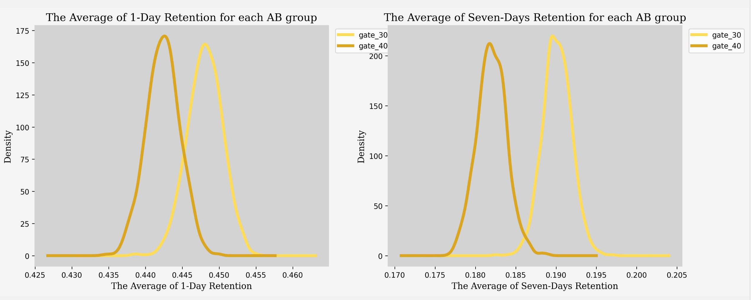
Now let’s explain the result we got through the chart above.
We can clearly see a significant difference between the two charts provided:
In the left chart, which illustrates the percentage of players returning to play 1 day after installation for both Gate 30 and Gate 40, the average retention rates are 44.8% and 44.2%, respectively. This indicates a slight decrease in retention for Gate 30 compared to the average.
On the other hand, the right chart displays the percentage of players returning to play 7 days after installation, representing seven-day retention. Here, we observe a notable decline in retention rates to 19% for both gates. This decrease in retention, which reflects the percentage of customers continuing to use a product or service over time, suggests that the company’s retention strategies may not be as effective. Failing to engage and satisfy customers could present challenges in maintaining consistent revenue and fostering long-term customer loyalty.
Now that we’ve conducted thorough research on the data, we can now address the central question at hand: Did moving the gate from level 30 to level 40 impact 1-day and 7-day user retention, as well as the average number of rounds played?
And now we will use the AB Testing.
To begin with the AB testing, let’s summarize the points we’ve established so far:
- The control group consists of users with the gate at level 30, while the test group comprises users with the gate at level 40.
- Users who played less than 30 rounds were excluded from the analysis, as they couldn’t have reached level 30 and changing the gate would have had no effect on their experience.
- The retention rate test involves bootstrapping a number of samples from our dataset for both the control and test groups. We will then compare the distribution of possible retention rates between the two groups.
- For the average number of rounds played, we will compare two sample means that come from the same population and use it to test whether the two sample means are equal or not. This approach is necessary because the rounds played variable does not follow a normal distribution.
Initial Hypothesis
H₀ : Changing the Time Gate from “Level 30” to “Level 40” doesn’t change user retention.
H₁ : Changing the Time Gate from “Level 30” to “Level 40” will change user retention.
To answer our initial hypothesis here above, we’ll use bootstrapping to see if the changes in player retention are because of chance or the game version change. We assume our data sample represents the whole population since it’s large and covers a wide range of player activity.
Let’s begin by examining the data for retention on day 1:
The print_summary function summarizes the results of a statistical test. It takes three inputs:
- The name of the test performed.
- The p-value obtained from the test.
- Predetermined significance level (usually 0.05).
Then the function then creates a small table to organize these results. If the p-value is less than the significance level, it means there’s enough evidence to reject the null hypothesis (the default assumption), suggesting that there’s a significant difference between the groups being compared. In this case, the function marks the test result as “Reject H0” and provides a comment indicating that the control and test groups likely come from different distributions. If the p-value is greater than or equal to the significance level, it means there isn’t enough evidence to reject the null hypothesis, suggesting that there’s no significant difference between the groups being compared. In this case, the function marks the test result as “Can’t reject H0” and provides a comment indicating that the control and test groups may come from the same distribution.
Now let’s continue examining the data for retention on day 7: